Home Tour: Before And After Modern Renovation
2021 Home Tour: Hey friends, we finally finished our home renovation! And, we put the house up for sale and have now sold it!
Here’s a room-by-room home tour showing you the before and after transformation of this 1994 house.
Including all of the many projects we completed throughout the renovation to give it a modern makeover!
Read on for the before-and-after photos and video walkthrough.
This site uses ads and affiliate content, earning commission on qualifying sales. Disclosure.
2021 Home Tour: Before And After Interior Renovation
Table of Contents
When we bought this 5-bedroom 3-bathroom house a few years back, it was in major need of a makeover.
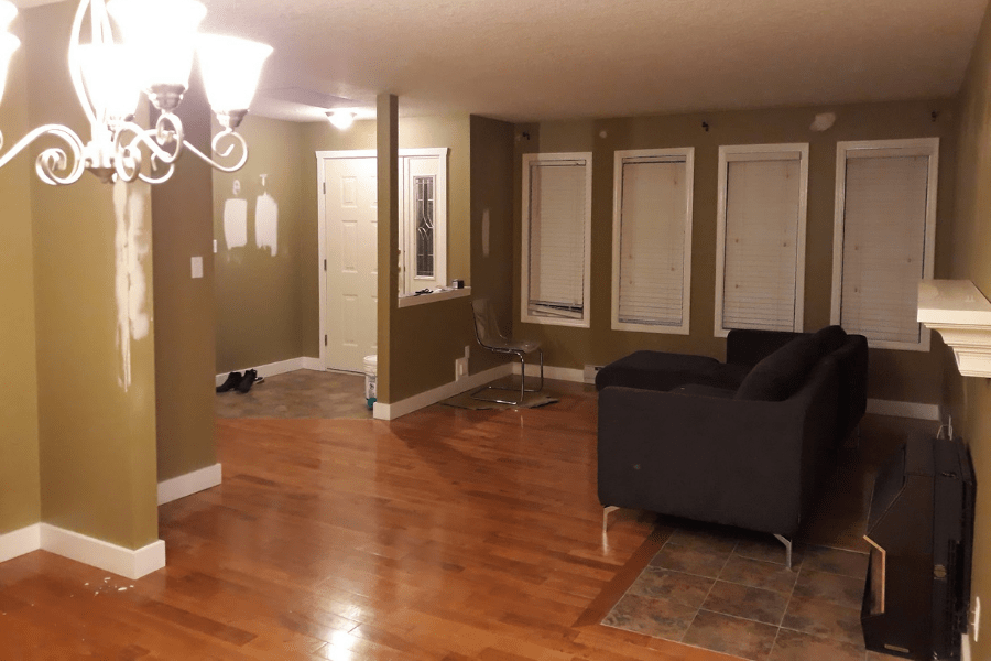
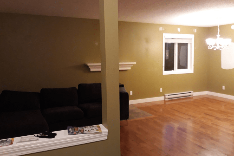
I’m talking dark pea-green walls, dark orange floors, red and green tiles, cheap 90s kitchen, brown carpets upstairs and pink shag carpets downstairs…
It was hideous!
…Hideously perfect and full of potential for a renovation.
So of course, my wife and I fell in love with it, scooped it up and got to work right away.
Let’s take you on a tour through the transformation!
The Livingroom
This is what the living room looked like before the renovation:
And this is what the living room looked like after the renovation.
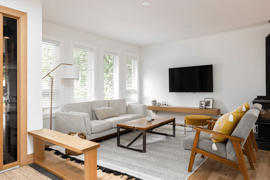
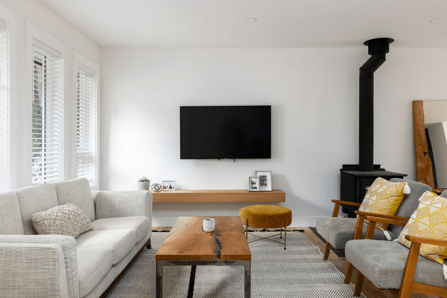
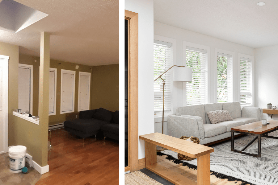
Obviously, a big bucket of white paint was involved.
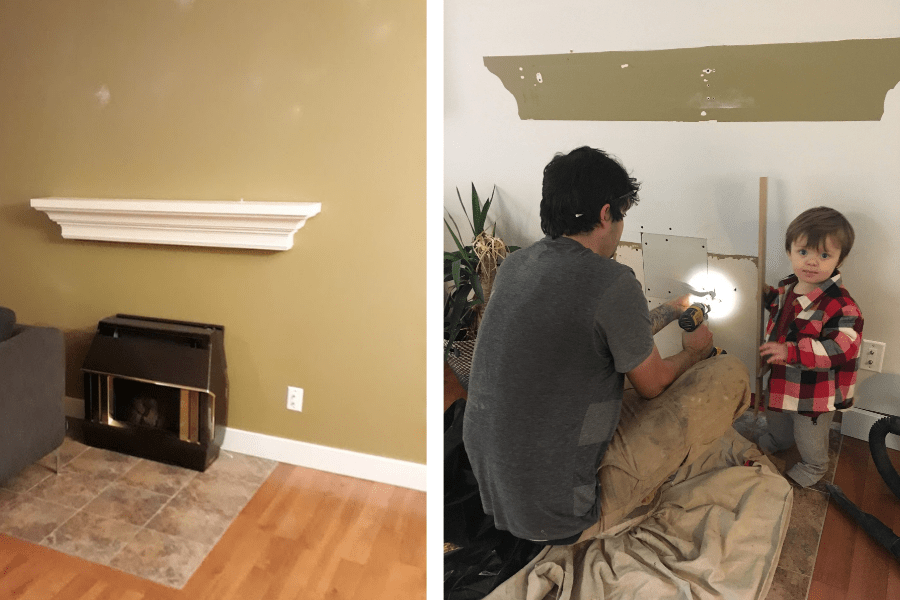
In the living room, I replaced the window trim, took down the pony wall, built a floating TV shelf, and replaced the old propane stove with a wood-burning stove (with Wolfe’s help).
I also swapped out the 90s tiles for some matte black hexagon ones.
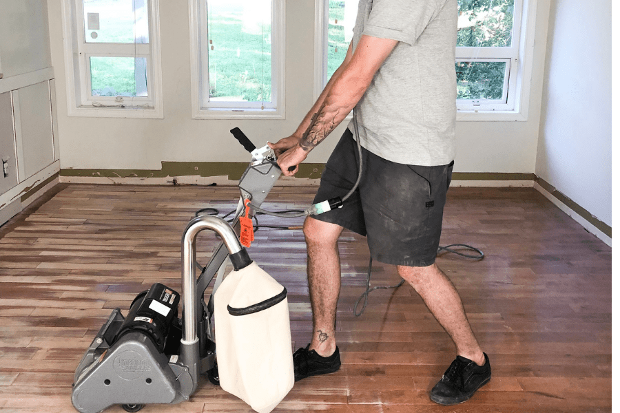
And, I spent weeks (!!) sanding and refinishing the dark orange hardwood floors, to bring out the light, beachy color. But it was worth it.
Side by side before and after shots:
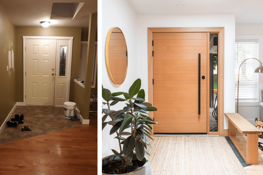
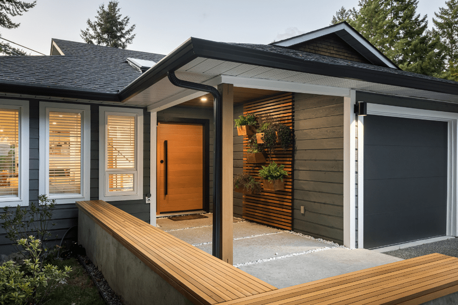
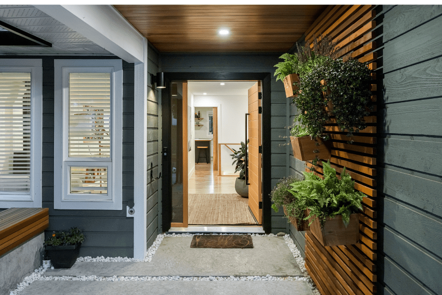
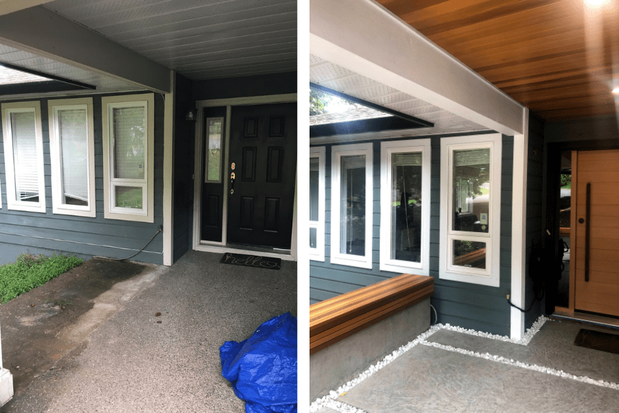
I put in a new door with a modern, 4 foot vertical handle, changed the tiles to a natural slate, and installed a white oak bench to bring some of the right kind of warmth to the space.
Interior Entryway & Stairs
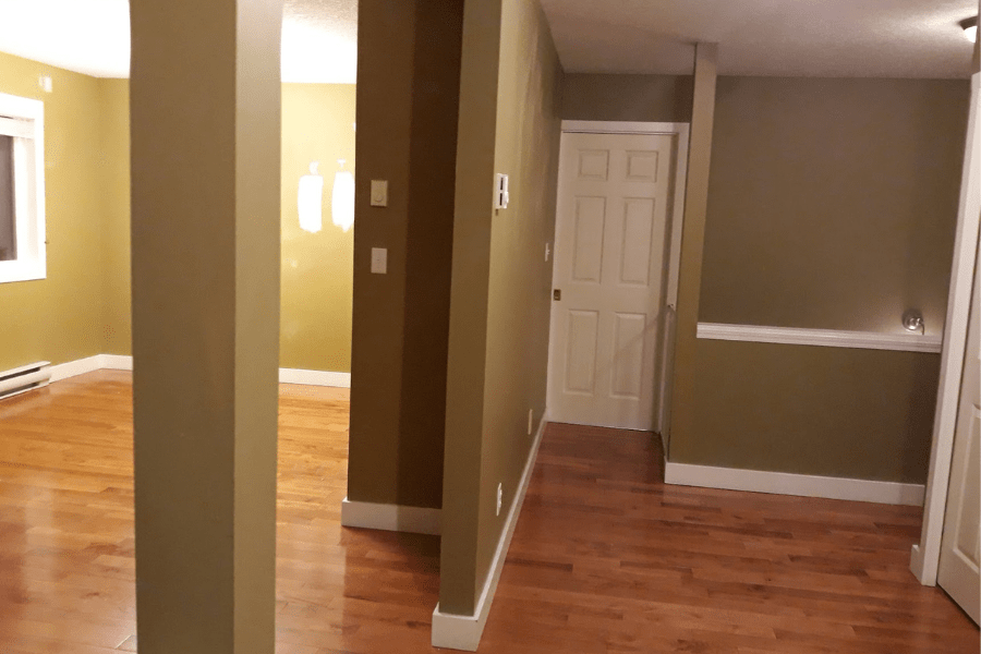
On the other side of the front door, we have the front hall and stairs. Again, it was pea-green, depressing and oh so dark!
Nothing a little white paint can’t fix. Add in some glass and white oak details and voila!
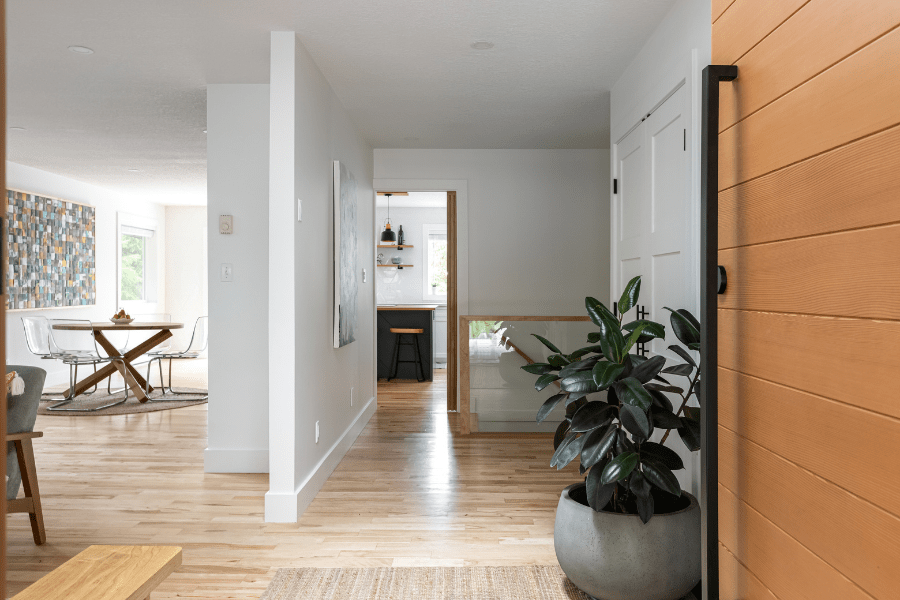
I had some fun updating the stairs.
Ripping out the brown carpet, and replacing the old handrail and railing with a custom white oak handrail and a new glass railing made a huge difference.
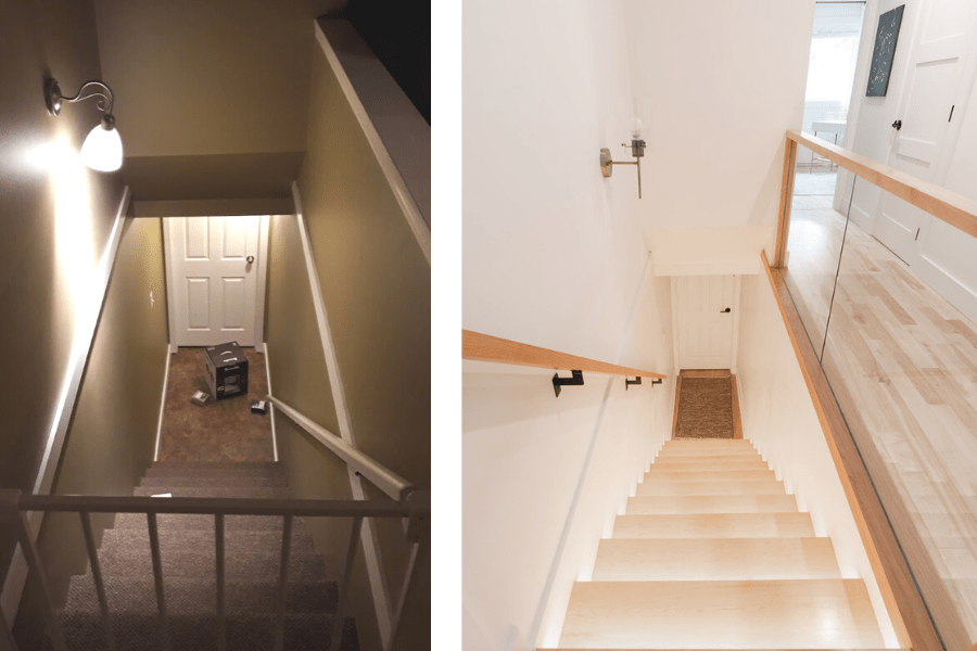
Check out the videos below for the full stairs tutorial.
The Kitchen
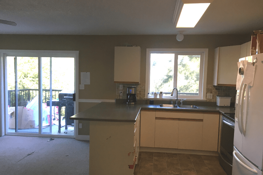
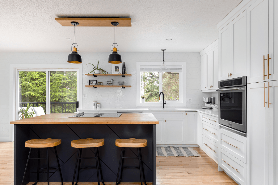
The kitchen renovation was a massive undertaking!
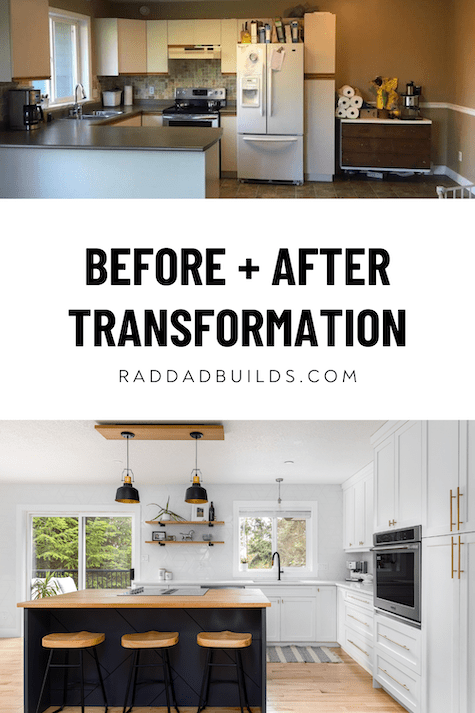
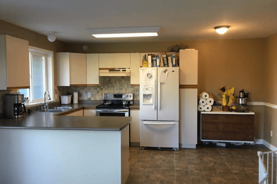
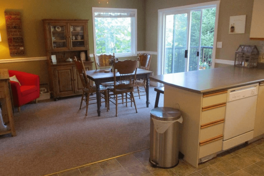
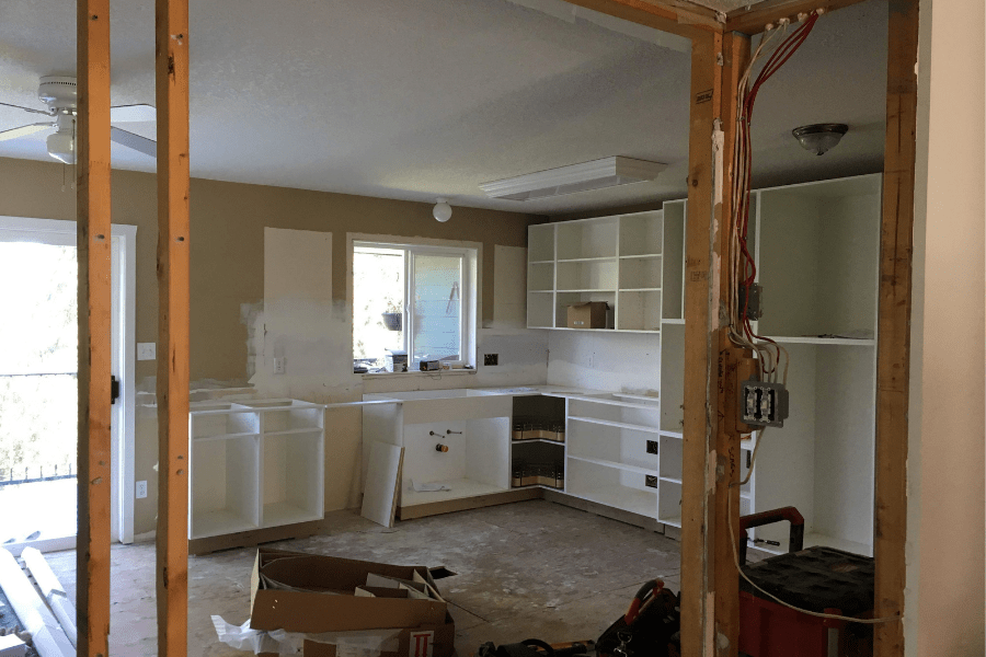
This is what the kitchen looked like when we moved in:
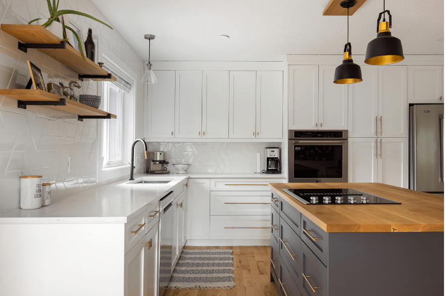
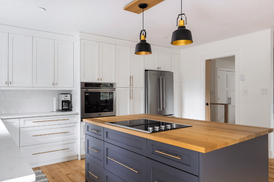
And here’s what it looks like now:
This was a complete gut-job, as you can see everything was taken out. We removed the wall in the living room as well.
View this post on Instagram
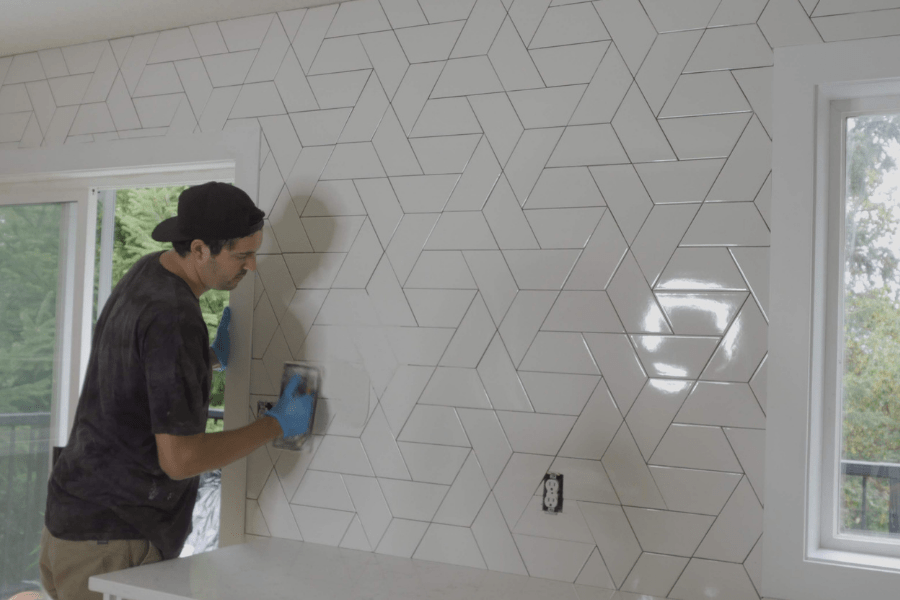
Chelsea saw this crazy tile pattern in a magazine and she somehow convinced me to take on the ambitious idea of tiling not just the backsplash, but the entire back wall of the kitchen.
I was not joking in the home tour video above when I said I was seeing this pattern in my dreams for weeks.
But it turned out epic, and it really gives the kitchen a one-of-a-kind luxury look.
Master Bedroom & Ensuite Bathroom
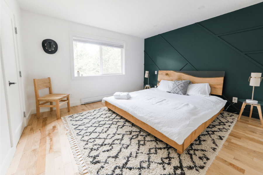
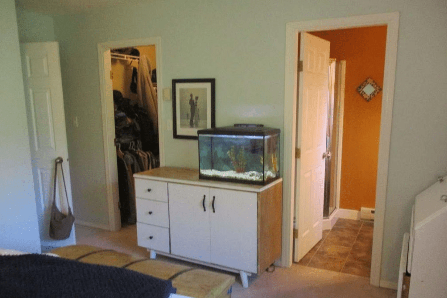
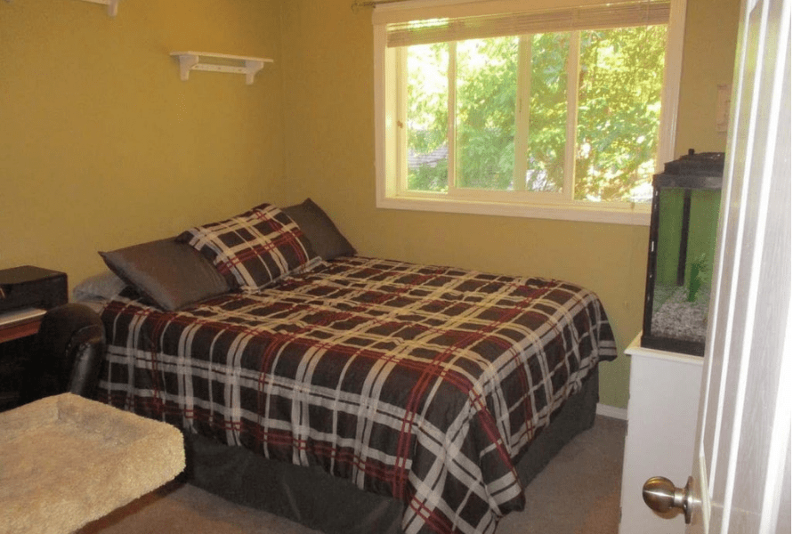
This is what the master bedroom and ensuite looked like when we bought the place:
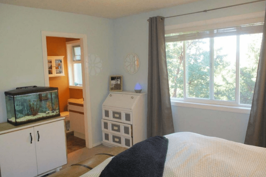
As you can see, the bedroom had dingy grey carpets (perhaps they were once white?) and like the rest of the house, outdated doors and wall trim.
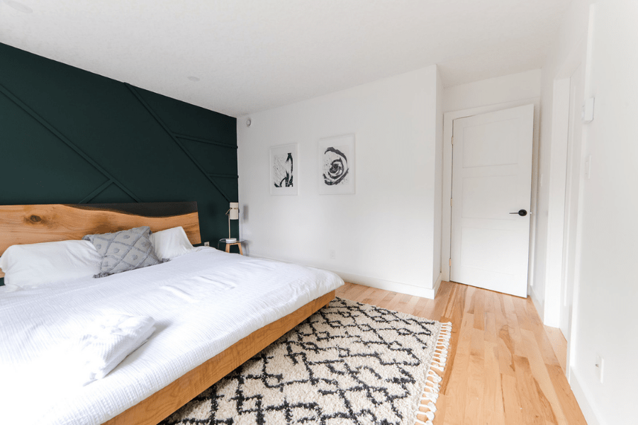
And here’s what it looks like now!
The master ensuite before and after the renovation:
Other Bedrooms
In addition to the master suite, this house has 4 other bedrooms. Two upstairs, and then a two-bedroom suite downstairs.
This is what the two upstairs bedrooms looked like before and after the renovation.
Kids room #1 before:
Kids room #1 after:
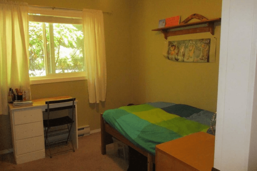
Kids room #2 before:
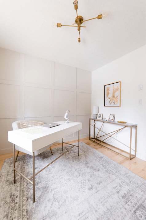
Kids room #2 after:
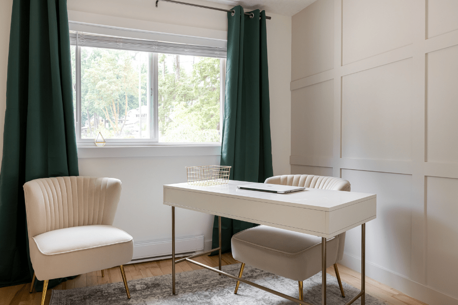
Chelsea styled the second kid’s room to function as her office. The white and brass desk is from this store.
Guest Bathroom
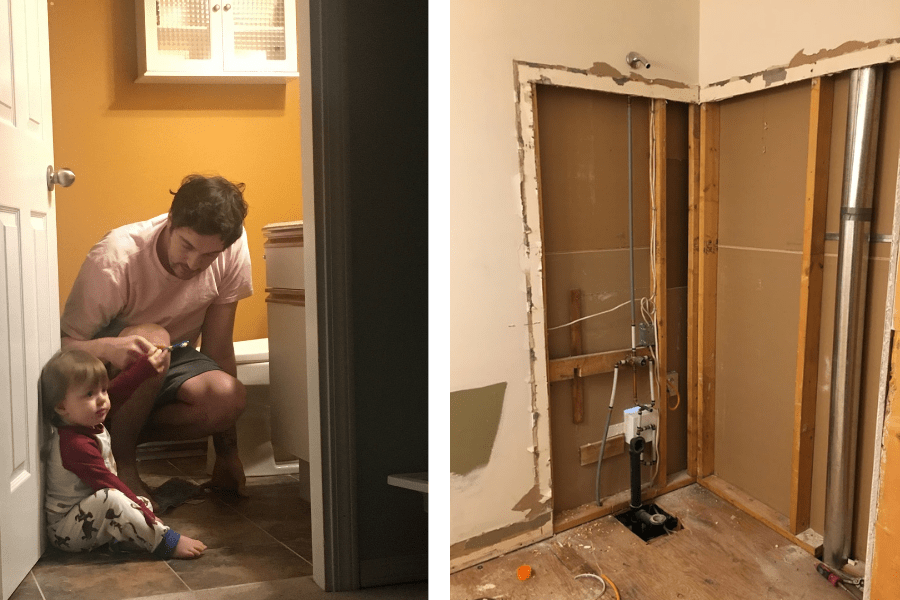
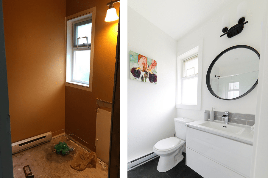
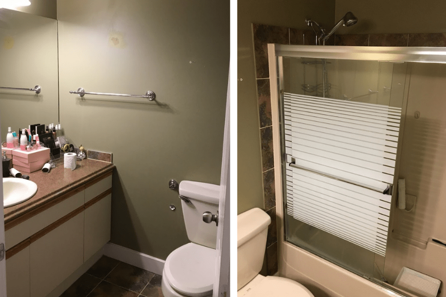
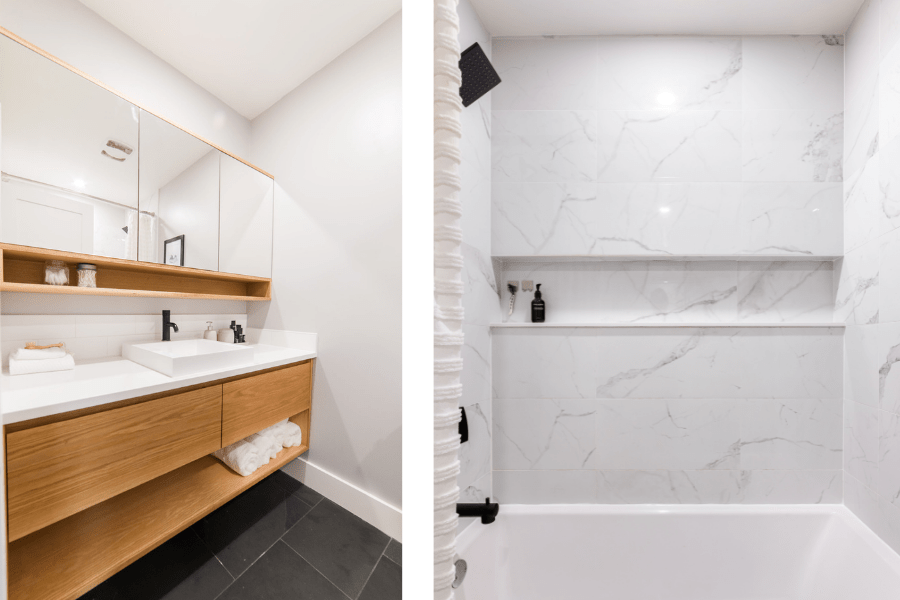
This is what the guest bathroom looked like before and after the renovation:
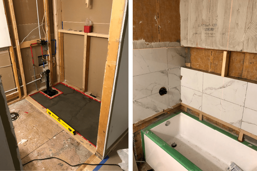
And the transformation…much better.
Check out how I built this DIY white oak cabinet and matching vanity.
The Laundry Room
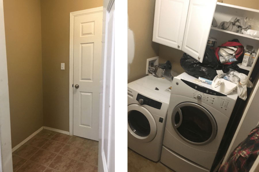
Like the rest of the house, the laundry room’s walls were a very dark, unattractive shade.
The room also didn’t function very well for its intended use, as you can see in the ‘before’ photo below:
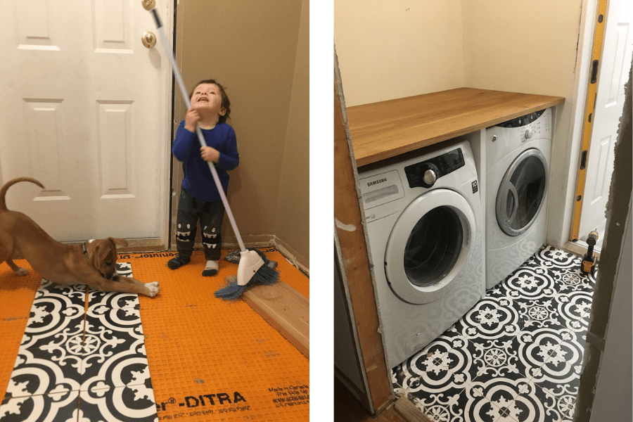
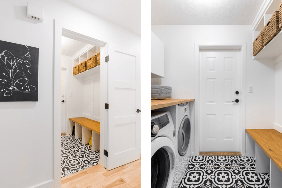
Some fresh new tiles and white paint brightened up the space.
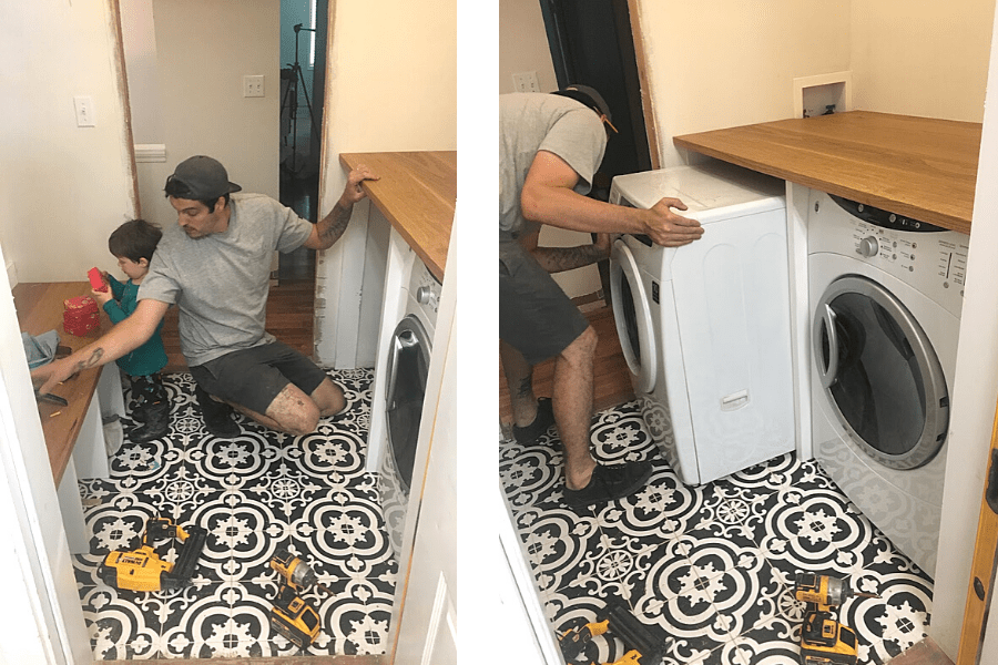
I created a custom white oak shelf and matching bench, to tie everything together.
Finally, the finished laundry room:
The Downstairs Media Room
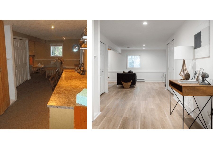
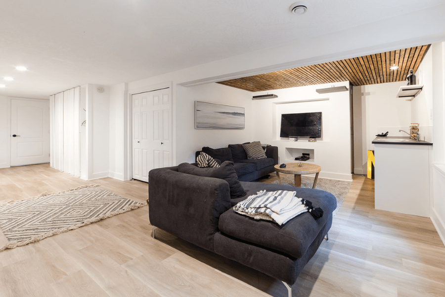
The media/family room downstairs was just another dark, outdated room when we moved in. Here’s a before and after:
I wanted to do something custom even for this room, so I put up some wood slats on part of the ceiling.
Related: Expert Tips on How You Can Create Budget-Friendly Luxury Décor
The Exterior
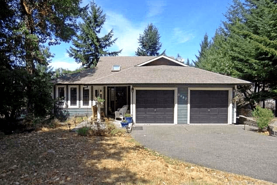
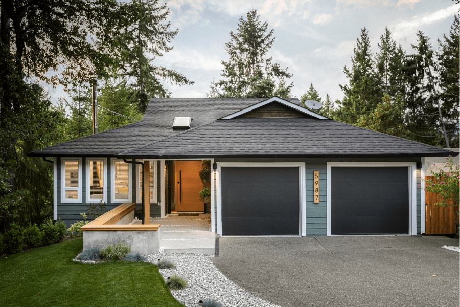
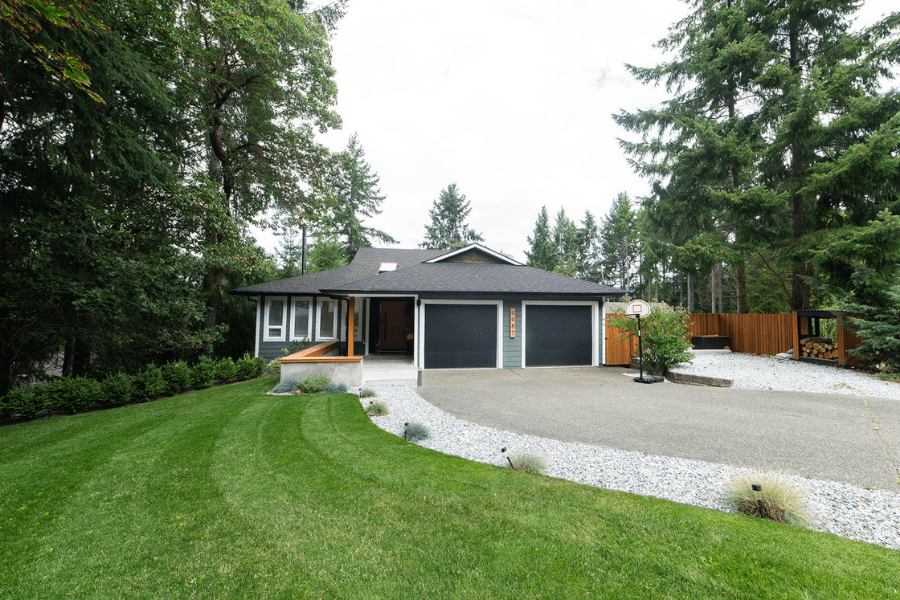
This is what the exterior of the home looked like before and after the renovation:
And here’s what it looks like now after some major curb appeal rehab:
Before and after side by side:
Now that this house has sold, we are packing up and getting ready to move into the new one.
Get ready for our next projects, coming soon!
Pin this:






Awesome build, Nick! I love the look of the cabinets.
Thank you!!